
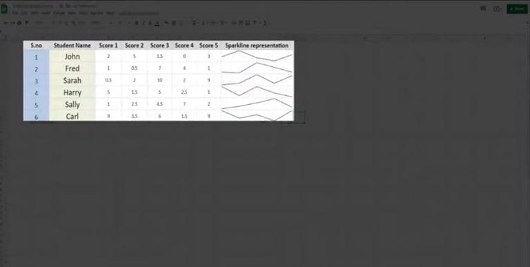

In Google Sheets, you can easily visualize your data in the form of tiny line graphs that illustrates a trend. We call this a Sparkline. All you have to do to add a Sparkline to your data is click on the cell you want to insert it and type =SPARKLINE, and enter the range of values enclosed in brackets. When you ENTER, you will get a small line graph visualizing your data.
Comments 0